Memory Tracer
HCI Master’s Thesis • 2019 - 2022
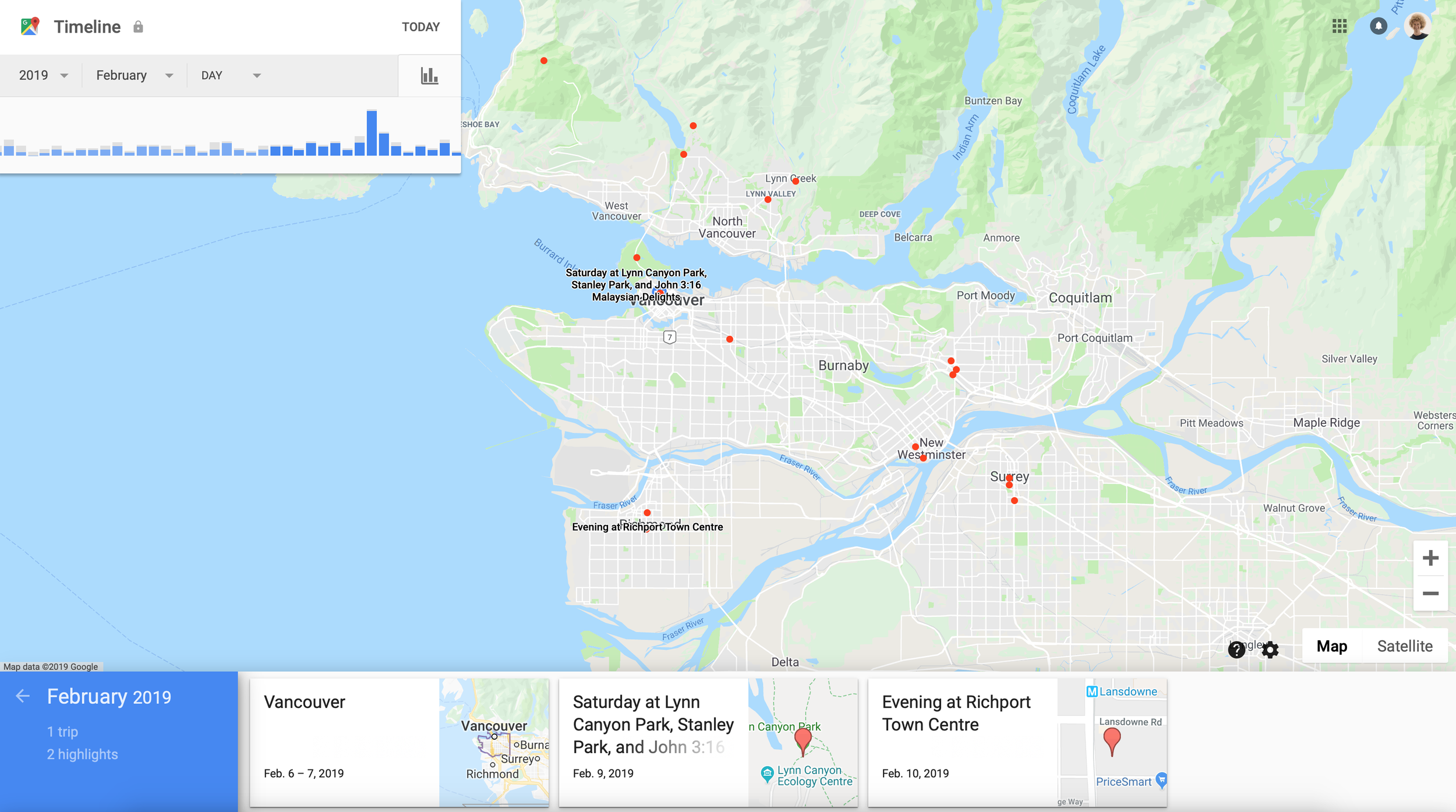
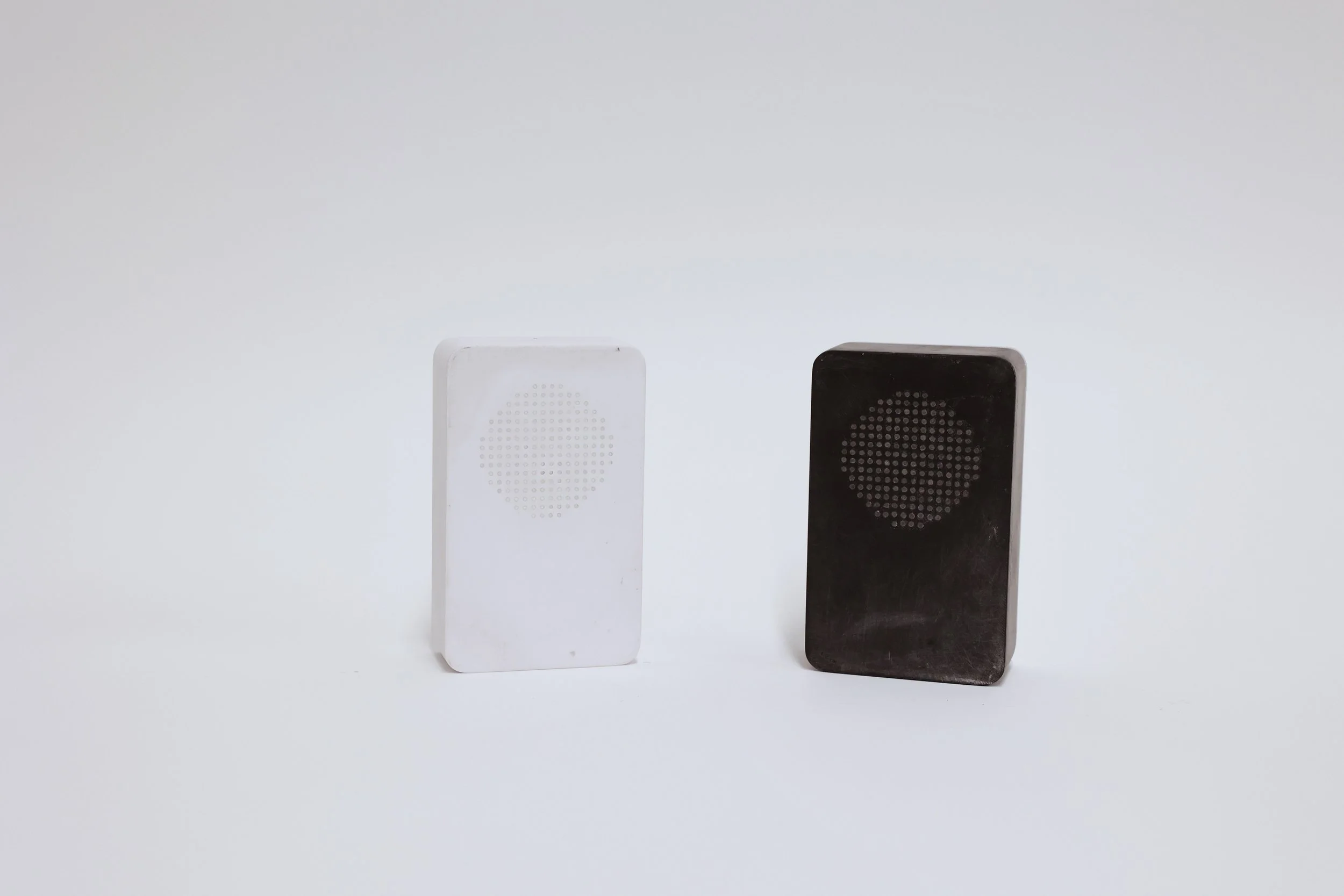
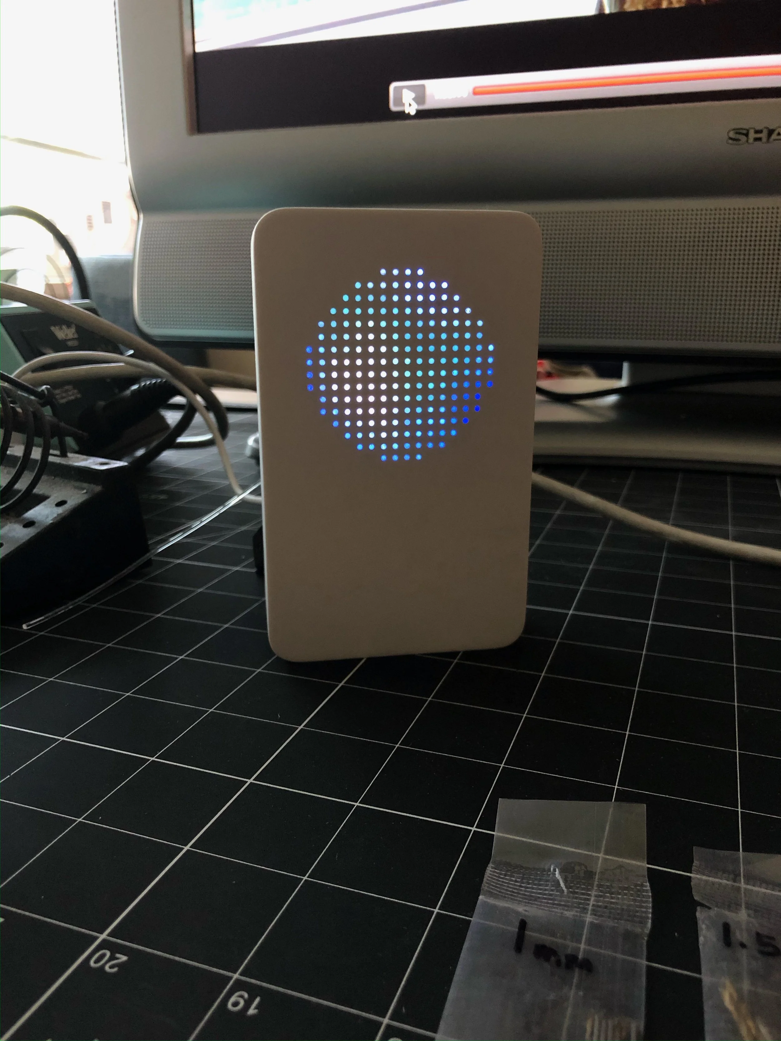
A device that occasionally, yet perpetually surfaces where you were on this day in history, pulling from your Google Maps Timeline.
My Roles
Interaction Design
Industrial Design
Electronics Prototyping
Software Development
Collaborators
• Jordan White | project lead• William Odom | supervisor
• Nico Brand | interaction design
• Ce (Kimi) Zhong | industrial design
Outcomes
• CHI '23 | Presented 1st author conference paper in Hamburg, Germany• HCI Masters '22 | Defended as part of my thesis
• DIS '20 | Presented 1st author work-in-progress remotely
Research Framing
It’s now possible to continually record
every place you ever go, with your smartphone and services like
Google Maps Timeline.
I was curious....how could location history data be used to design a
tangible device that
prompts reminiscence on the past?
Google Maps Timeline
JSON of a single location moment.
Early Explorations
I began the design process by building crude Python scripts, which helped me get a handle on what could be extracted from the dataset.
- Learned how to work with a large metadata sets in a designerly way
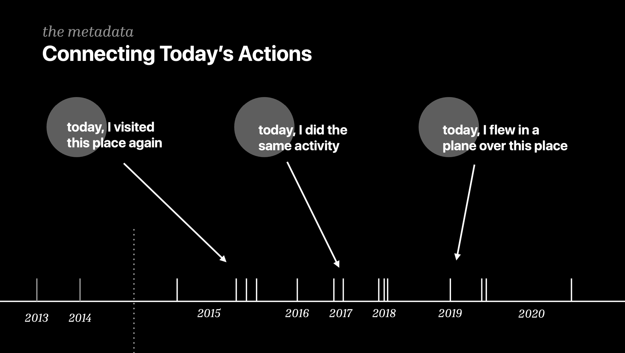
- Realized simply mapping a moment from today's date in history could spark a memory
- Some items I could extract:
+ days I was on trips
+ cities and places frequently visited
+ descriptions: ‘biking for 2 hours on a sunny Sunday afternoon in San Francisco’
Early Explorations
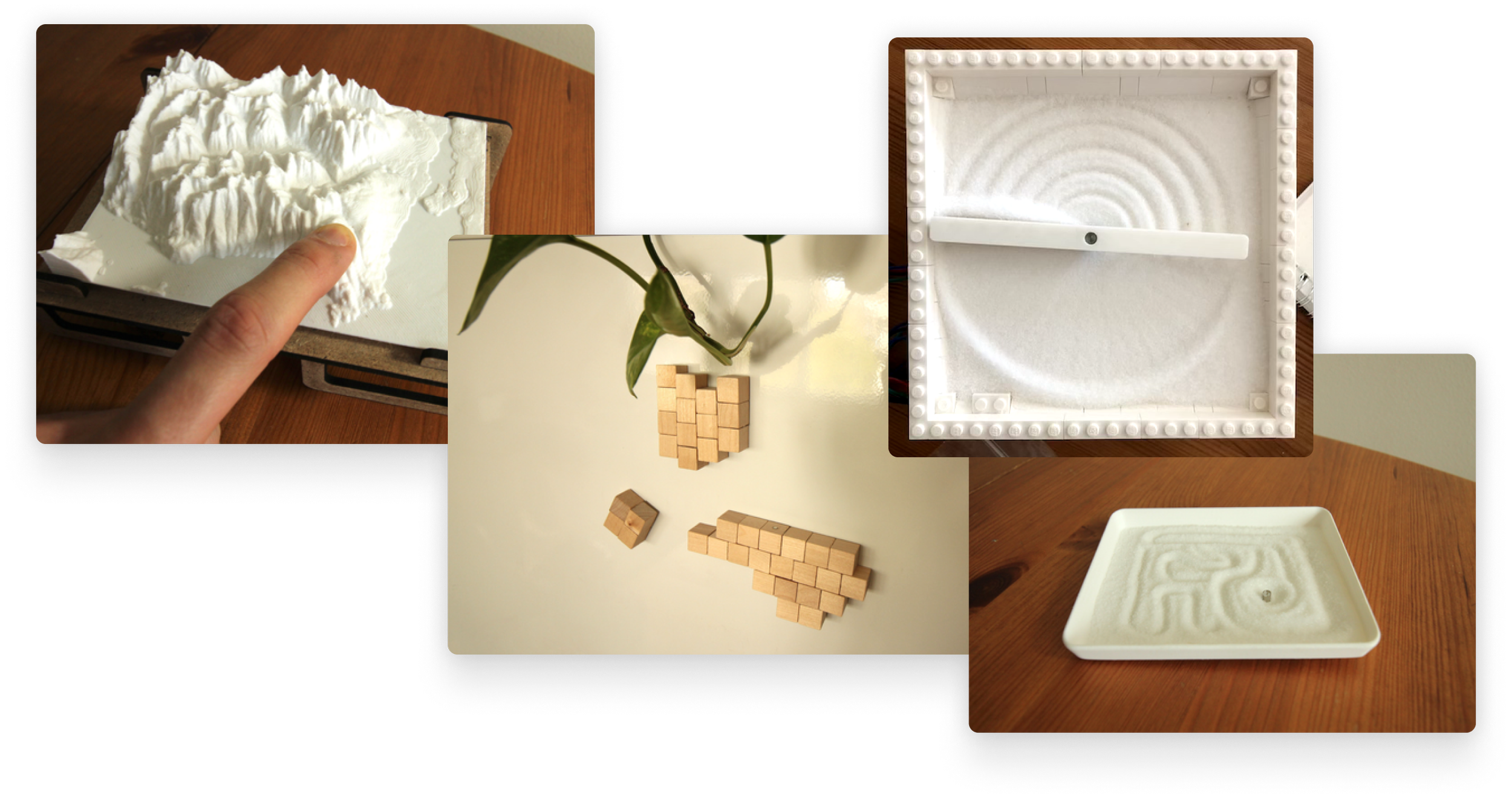
In conjunction, I explored various physical forms which could act as interaction points.
- Found the sand tracer prototypes were very intriguing
- Quality we most liked was the continual and slow reveal of a pattern over time
- Realized slow reveal could indicate something about a location as it slowly surfaced
Vocab from Design Exploration
moment : most basic piece of location data
(timestamp, latitude, longitude)
location day : all moments that took place on a given day
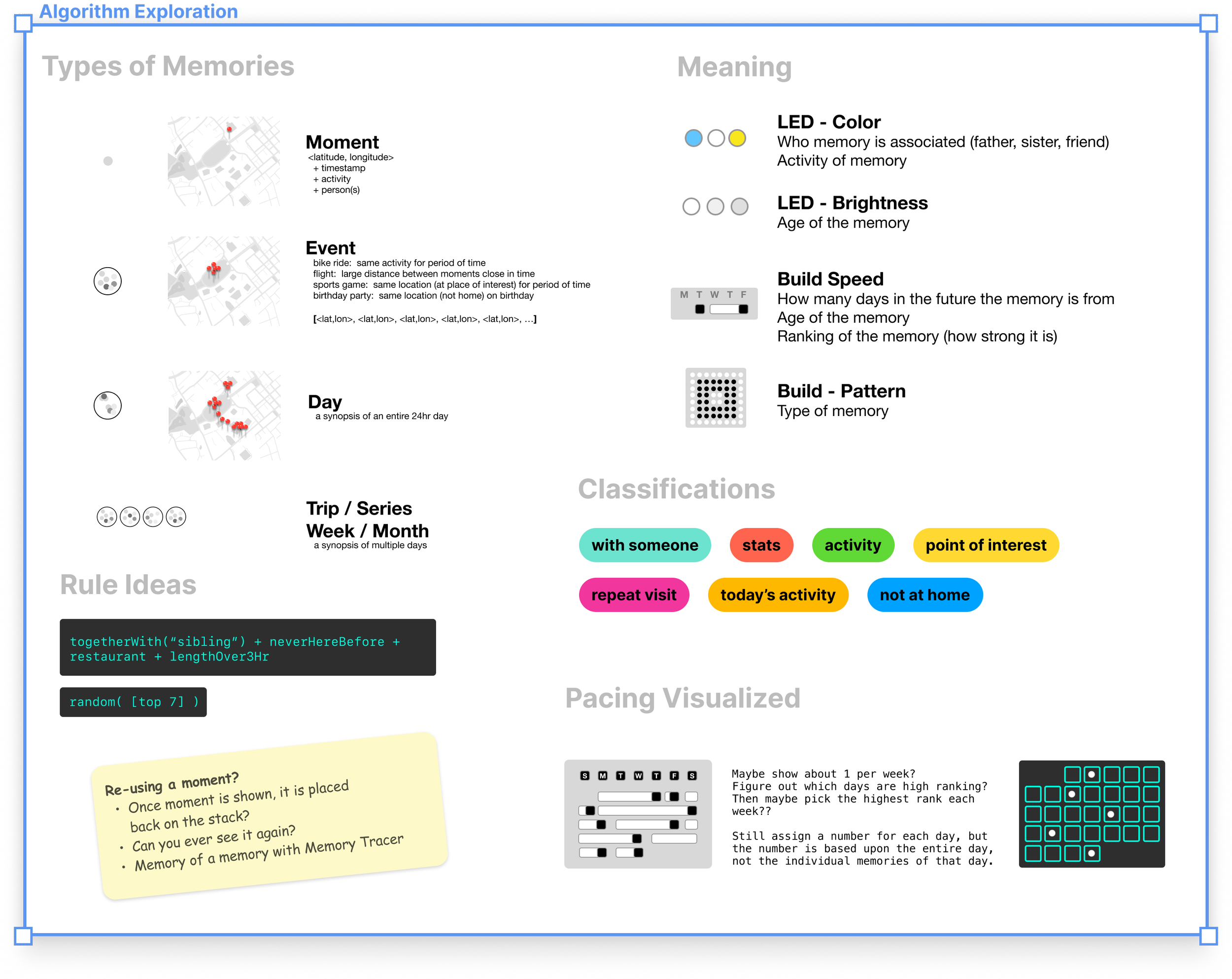
Algorithm Exploration
Explored creating algorithms that could find specific kinds of memories from the dataset.
- While I liked the ability to retrieve specific kinds of memories
- I was concerned that the algorithm could be too aligned with my specific travel history and not scale to others
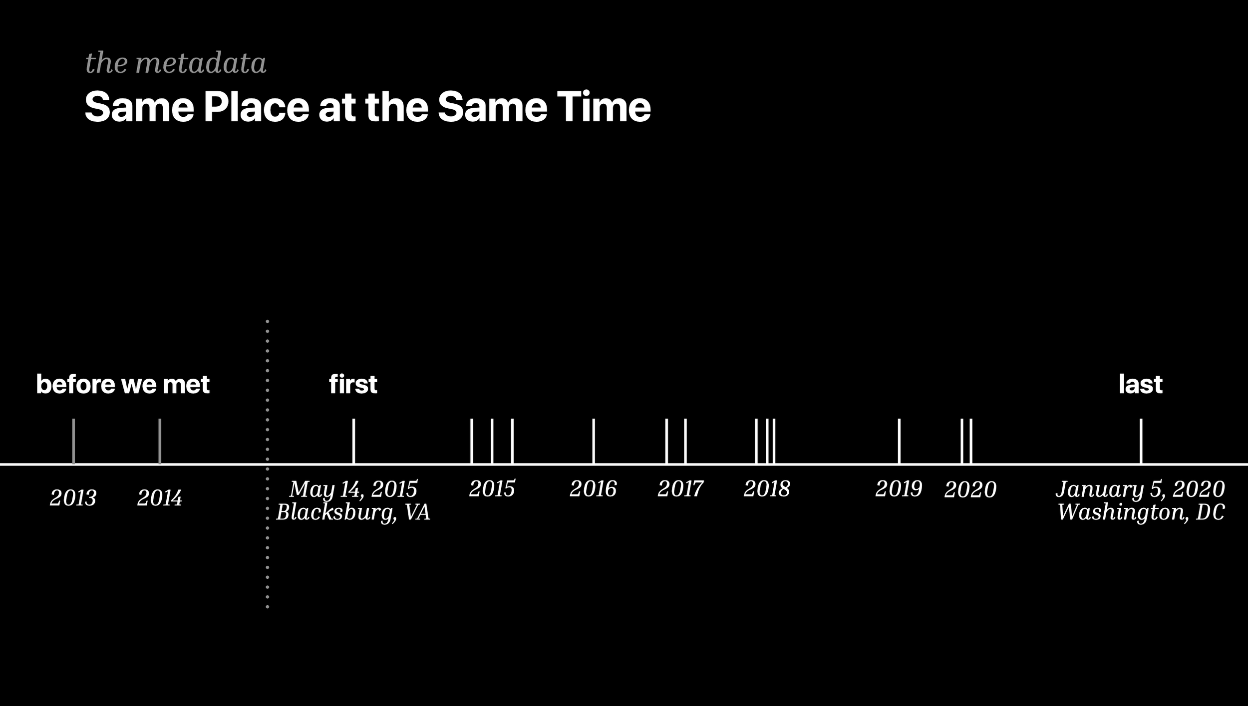
Experimented with comparing location data with a friend and how today's activities might connect with the past.
- Wrote a script showing every time me and a friend were within a few feet
- Discovered that comparing location history has a lot of cool possibilities
- Ultimately decided to not go this route, mainly due to how it greatly limited the possible moments from my archive
Hardware Decision
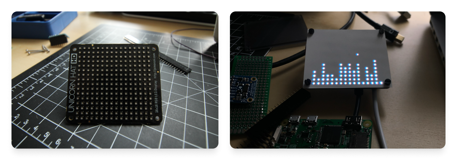
Eventually shifted to using a 16x16 LED matrix, which provided a higher resolution output and was much easier to work with.
LED Matrix Prototype
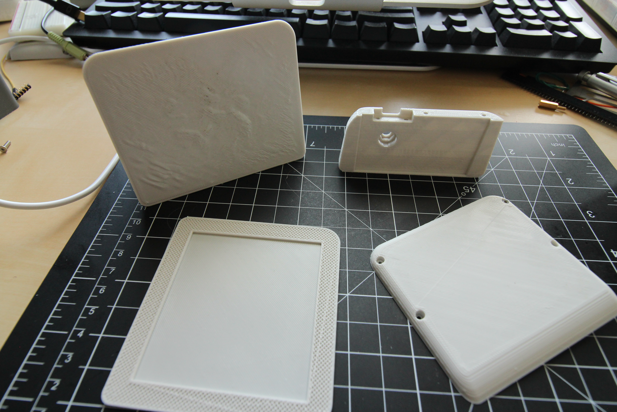
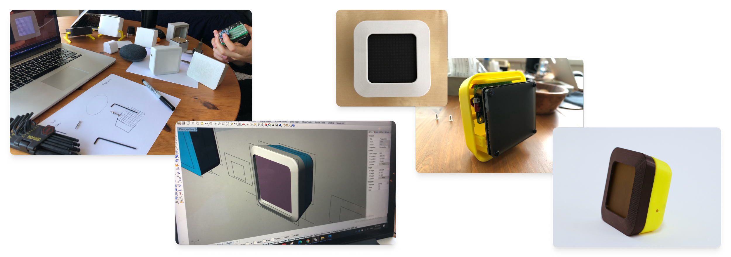
Prototyping, 3D modeling, electronics, assembly
Like an hourglass, it indicates
when a new moment would arrive.
Upon arrival of the moment,
you can see hints on when and where it was.
- Seeing a random moment being surfaced in the background was delightful
- However, the hourglass animation was underwhelming
- Seeing hints about the moment was enjoyable and akin to a game
- Enclosure's form was 'meh' at best
- How to work with a Pi Zero LED display and accelerometer for input
Goals for the form following this prototype
• Does not merely look like an enclosure for a screen
• Invites peering into
• Feels durable and weighty
Iterating on Visuals
Experimenting with a map on the display
- Aesthetically the pixelated map looked nice
- We could sometimes decipher the location or at least get hints about the location
- Fast prototyping with p5.js + laser cut grid taped to laptop screen
- User tested with studio mates using their location data
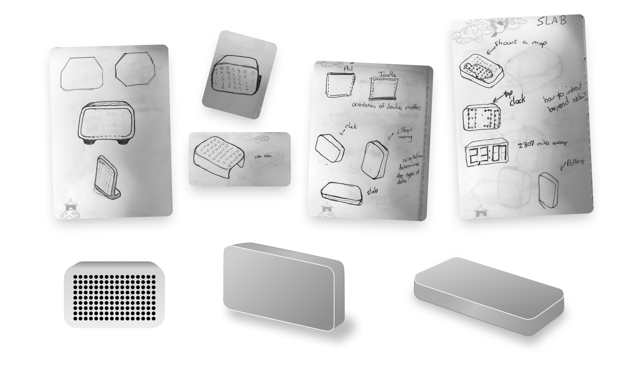
Iterating on Form
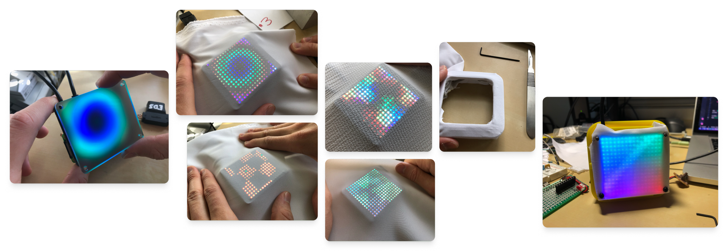
Diffusion Experiments
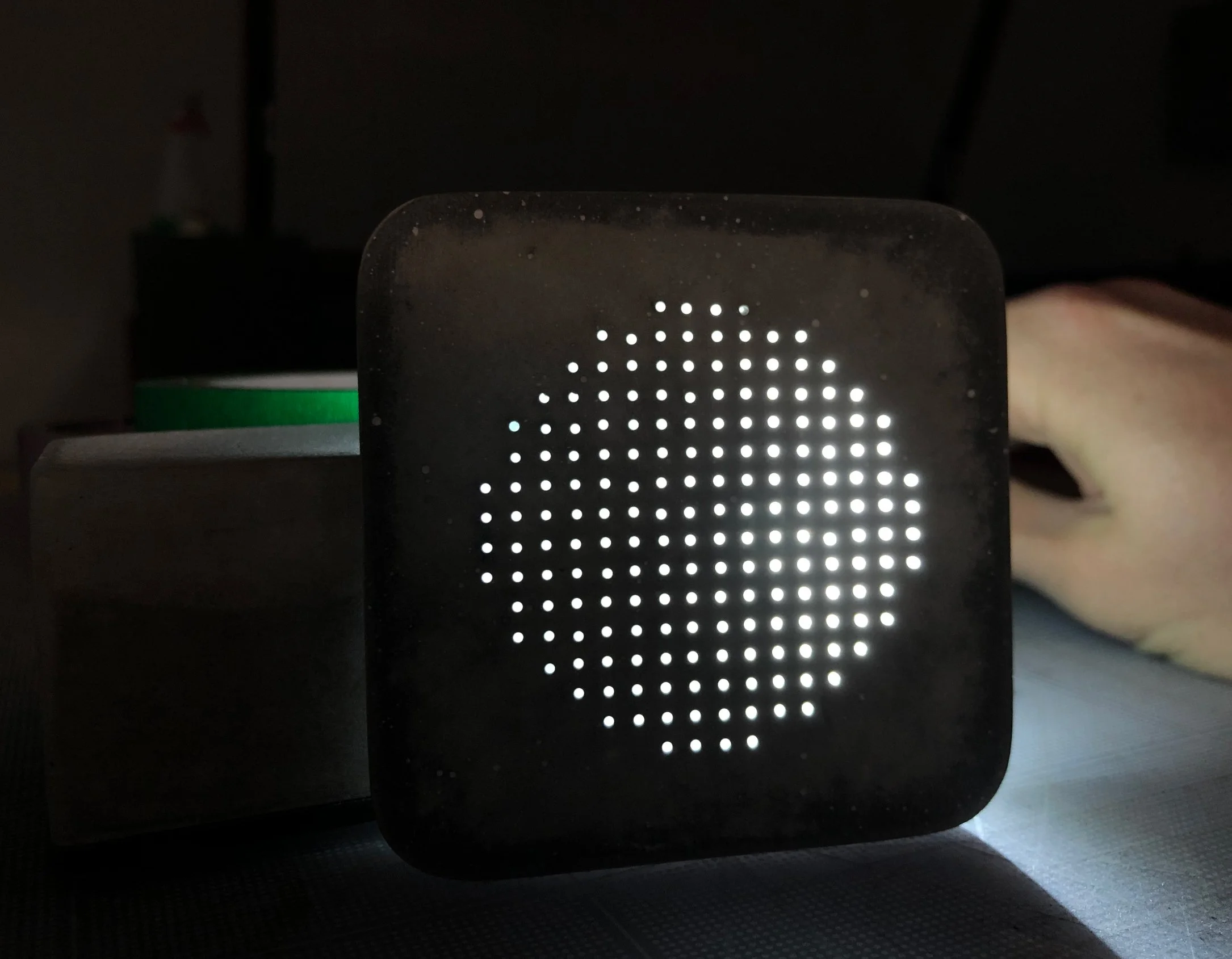
Fiber Optics and Cement Experiments
I really liked the aesthetic and weight of cement, but being able to pass light through it posed a problem. I began exploring embedding fiber optics in cement. It ended up working well and gave a really cool effect!
I found cropping the corners of the matrix (creating a more circular display) gave a more organic, unobtrusive aesthetic. It made the light look more like a portal that could be looked into, which achieved the quality of inviting peering into.
More Form Iterations
I wanted the device to not just look like a screen inside an enclosure.
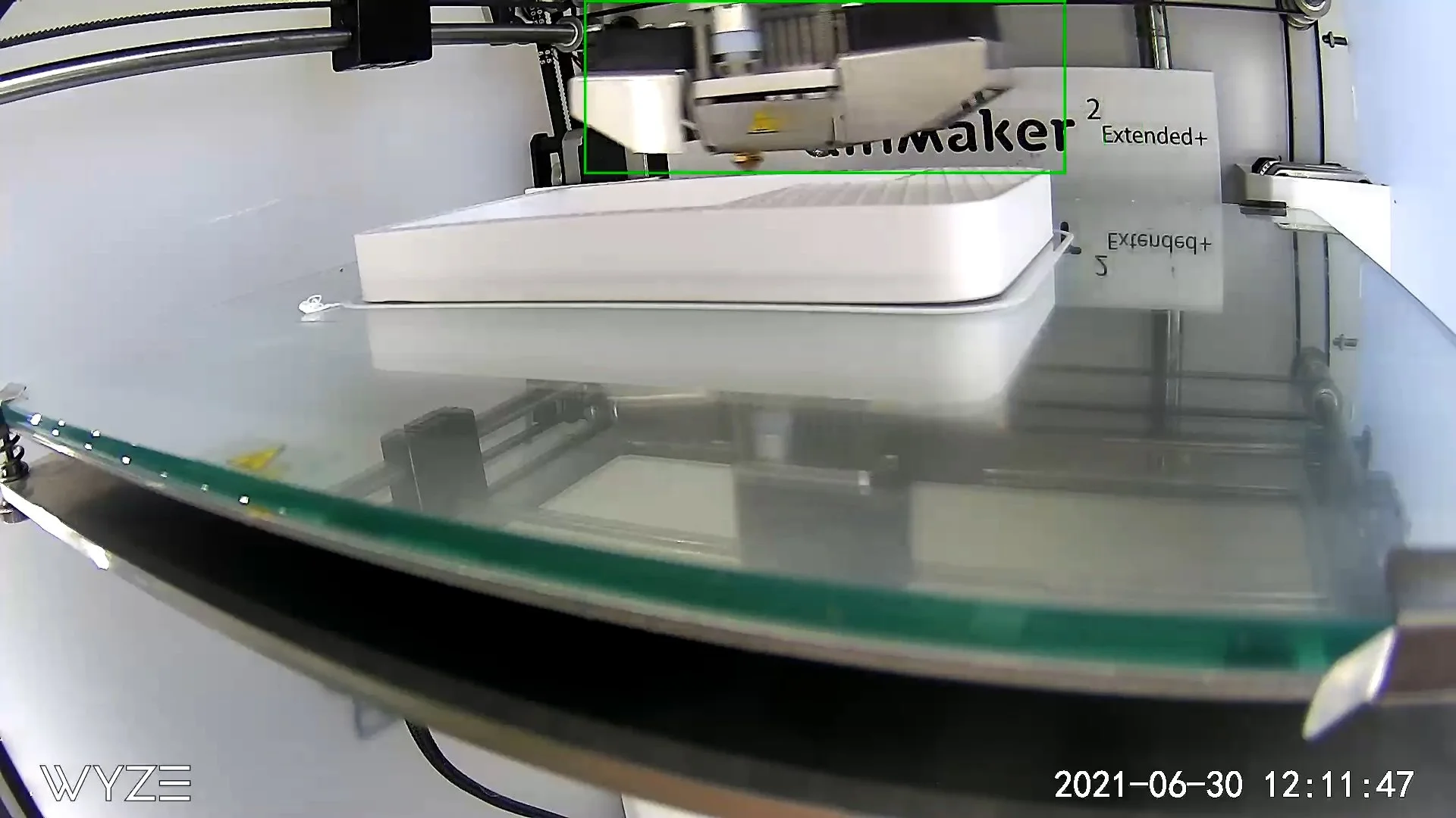
I changed the form to resemble a more rectangular monolith shape and set the LED matrix display in the upper portion of the enclosure. This achieved the goal of it not looking like merely an enclosure for a screen.
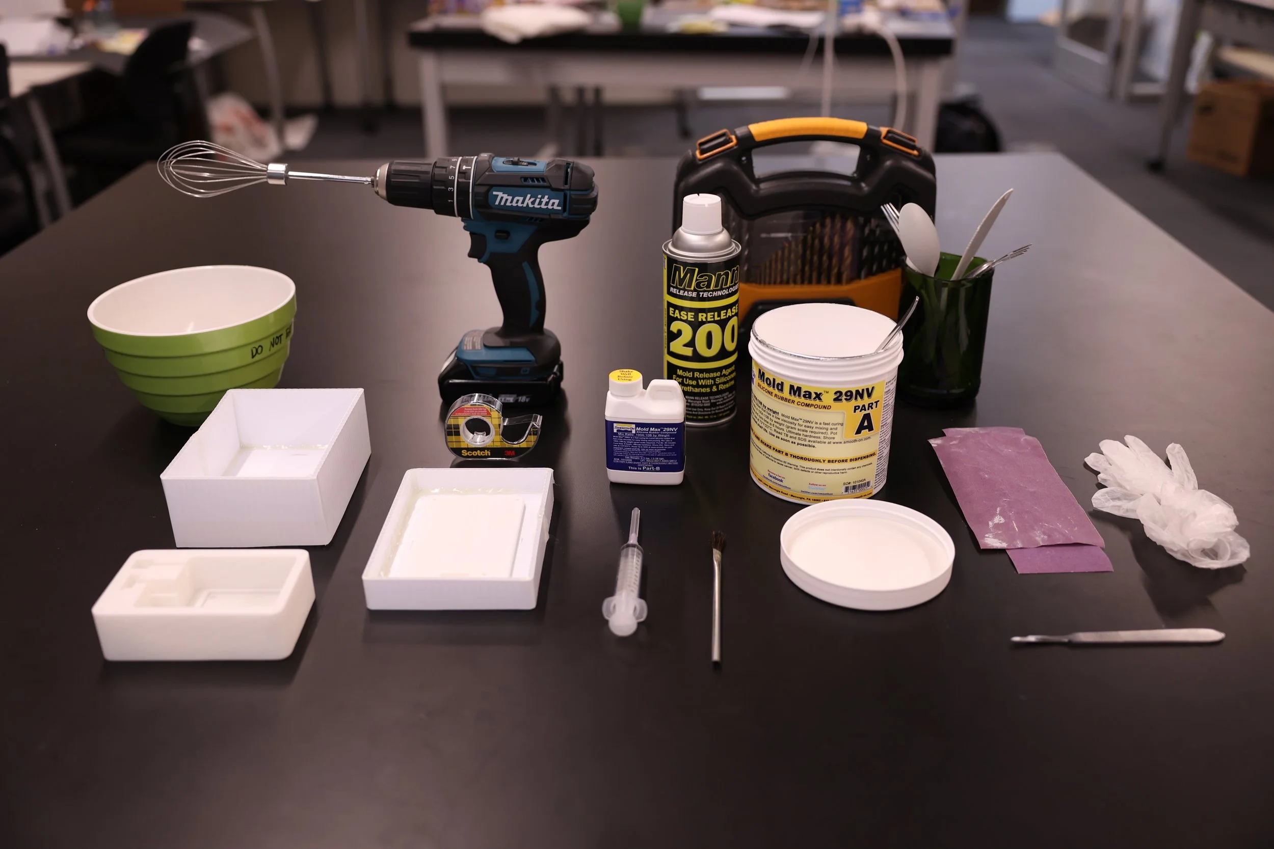
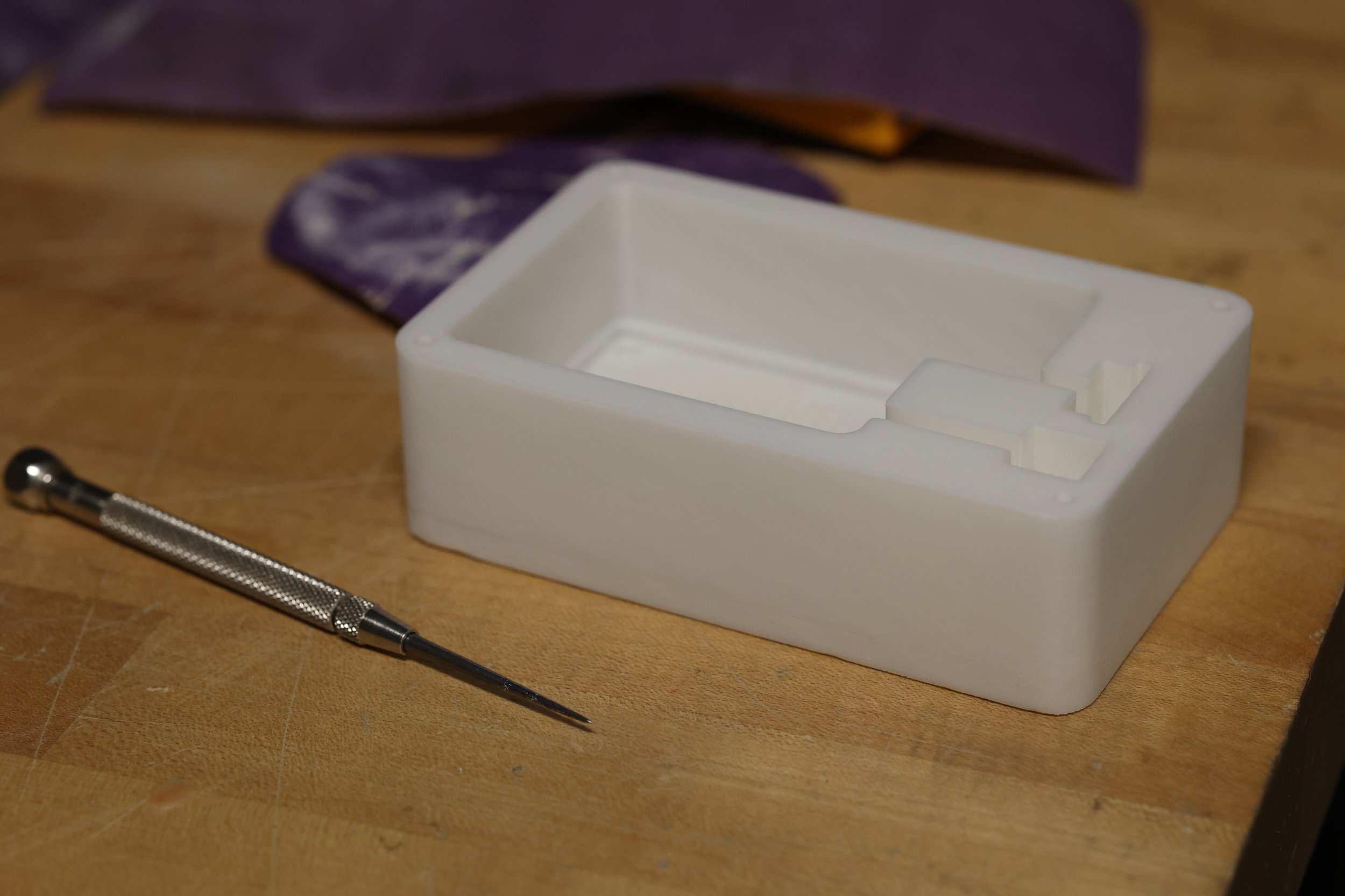
Casting Final Form out of Rockite
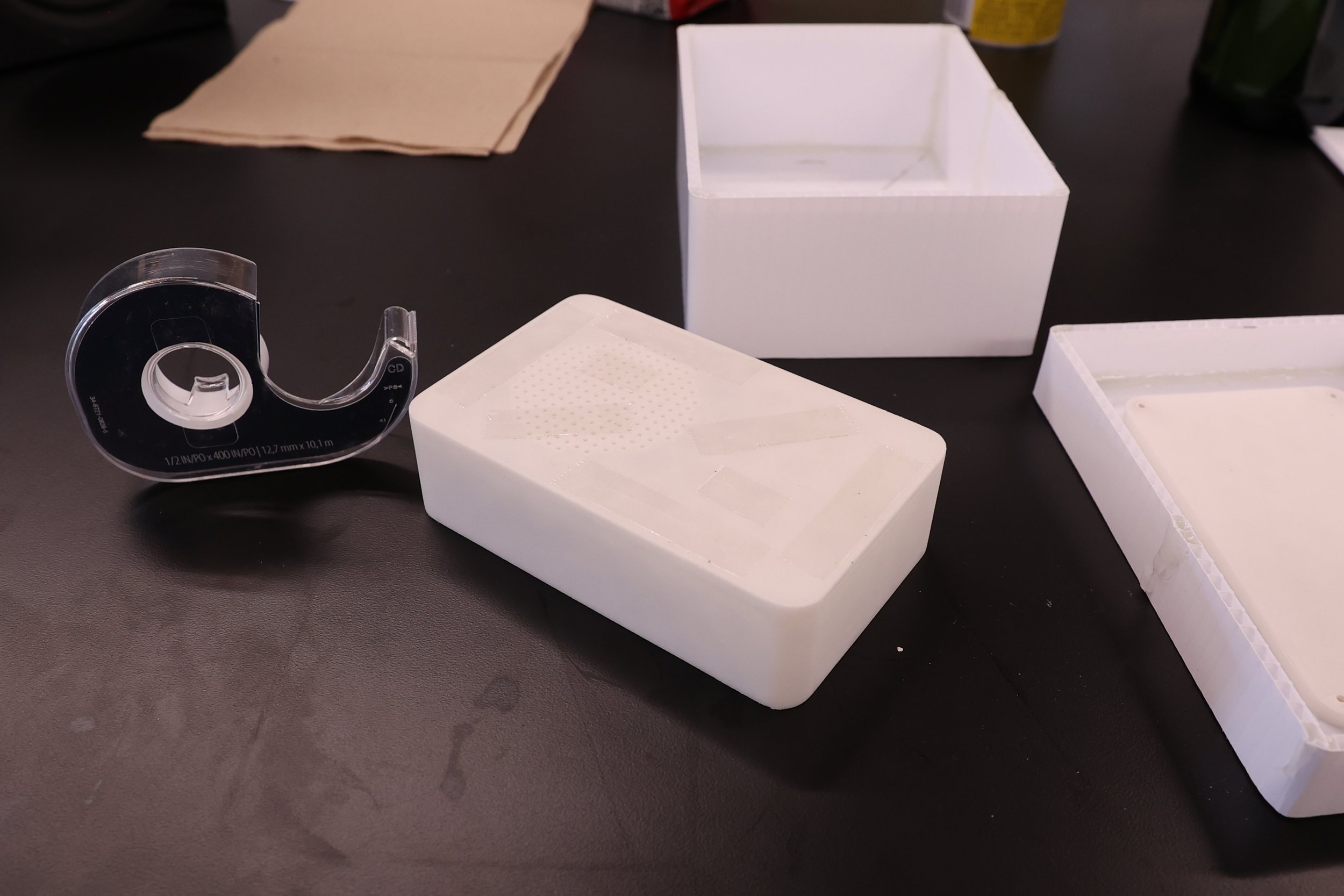
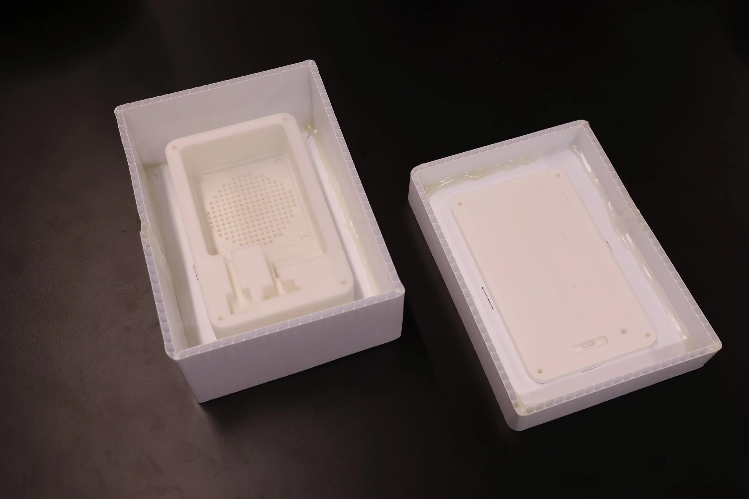
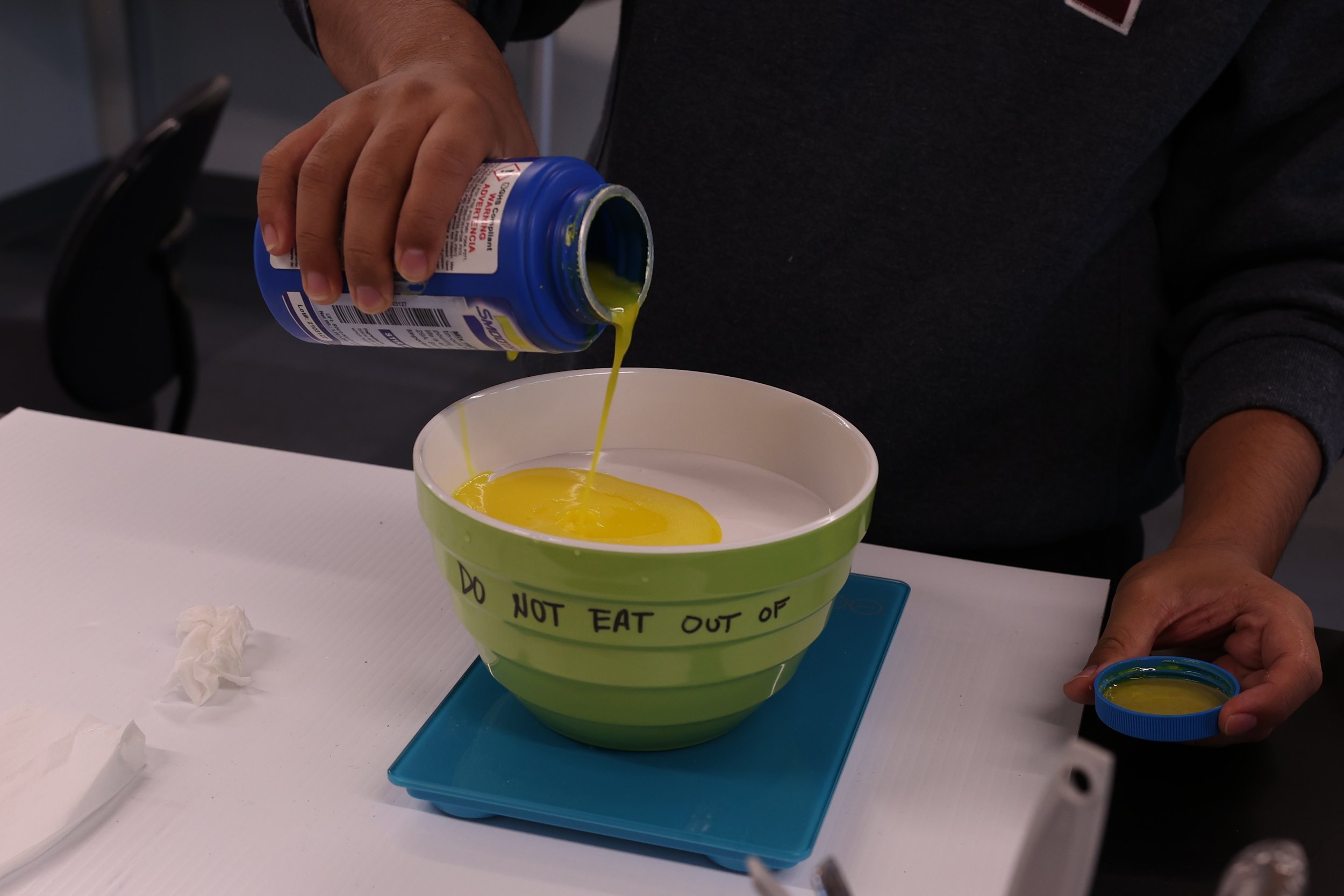
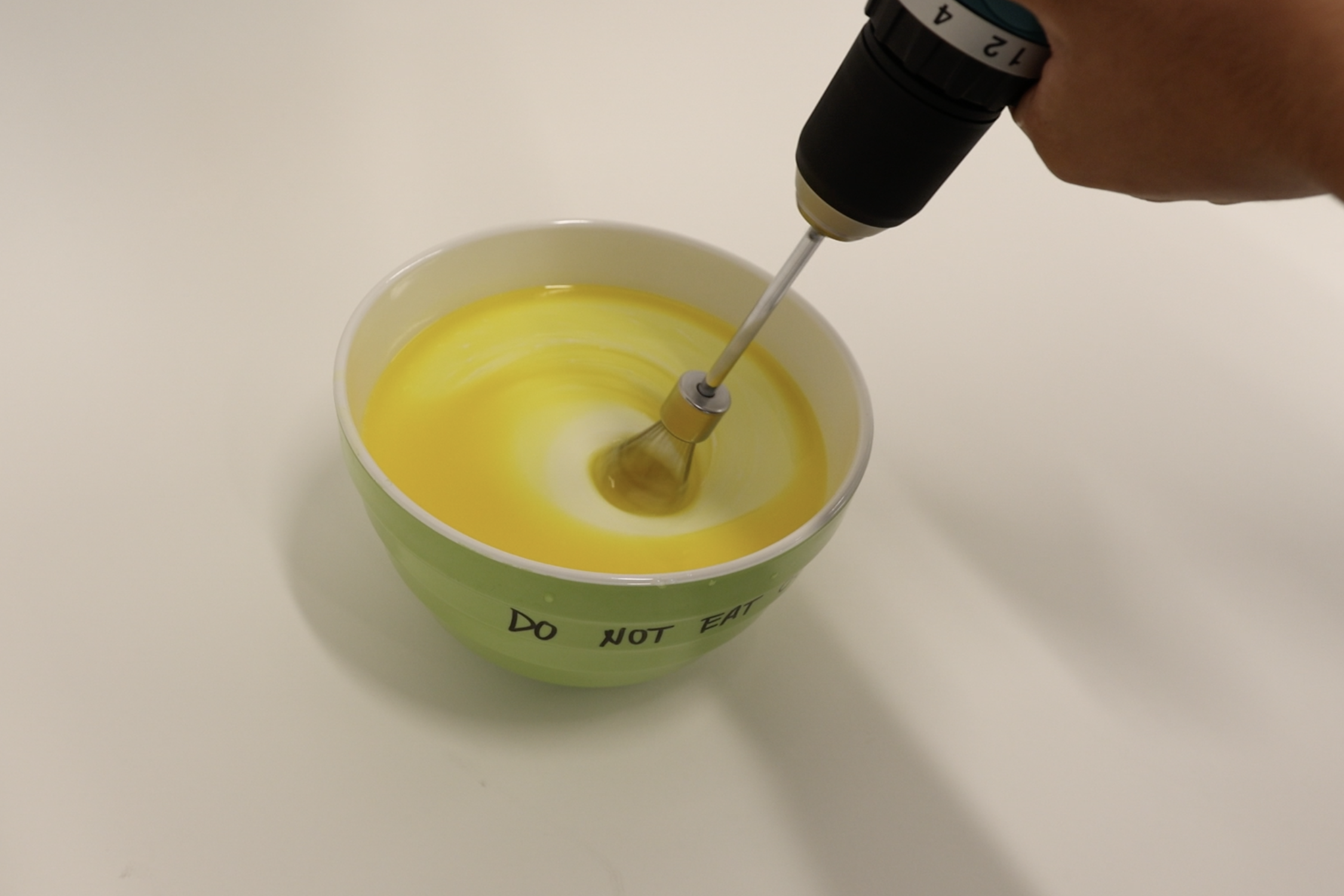
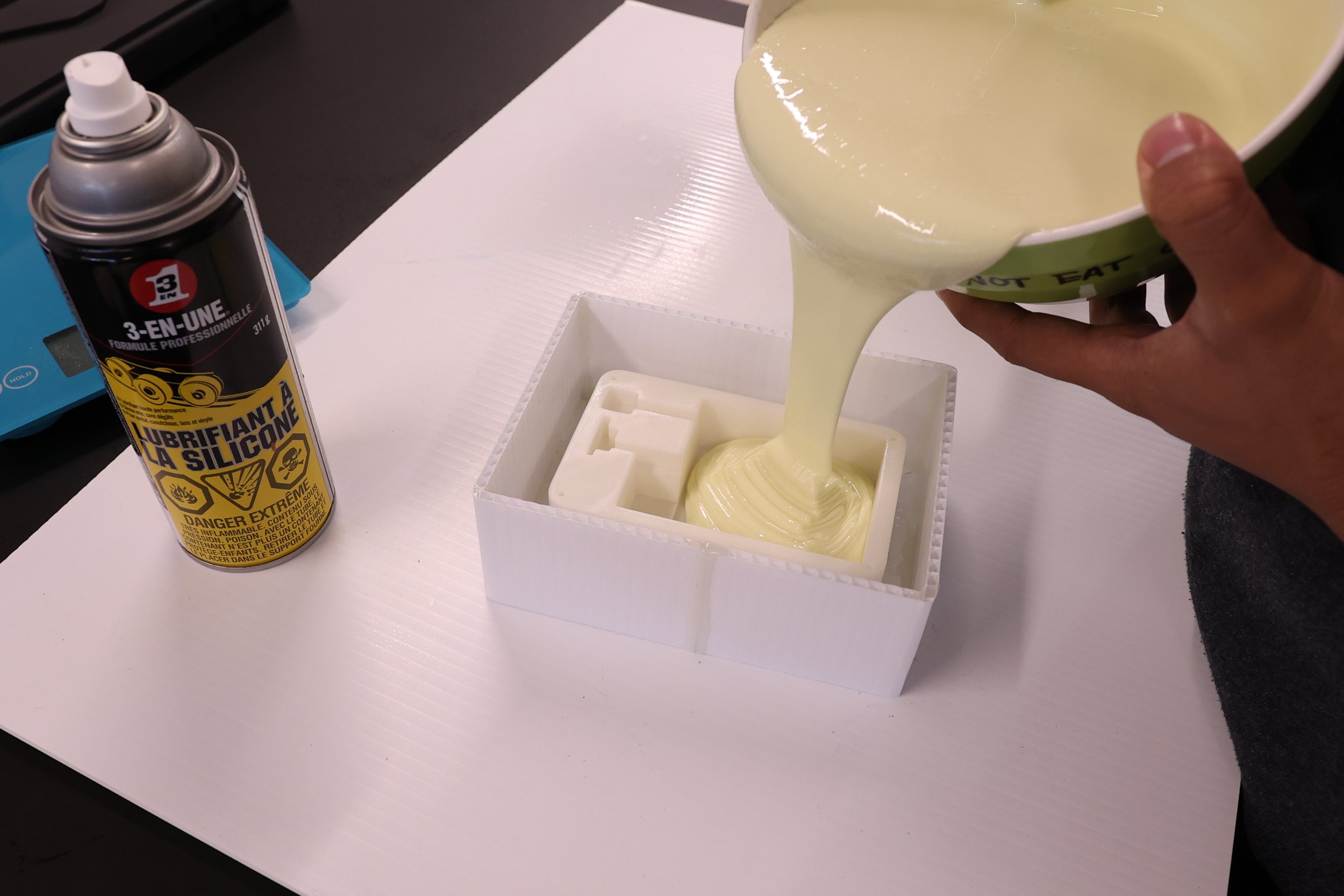
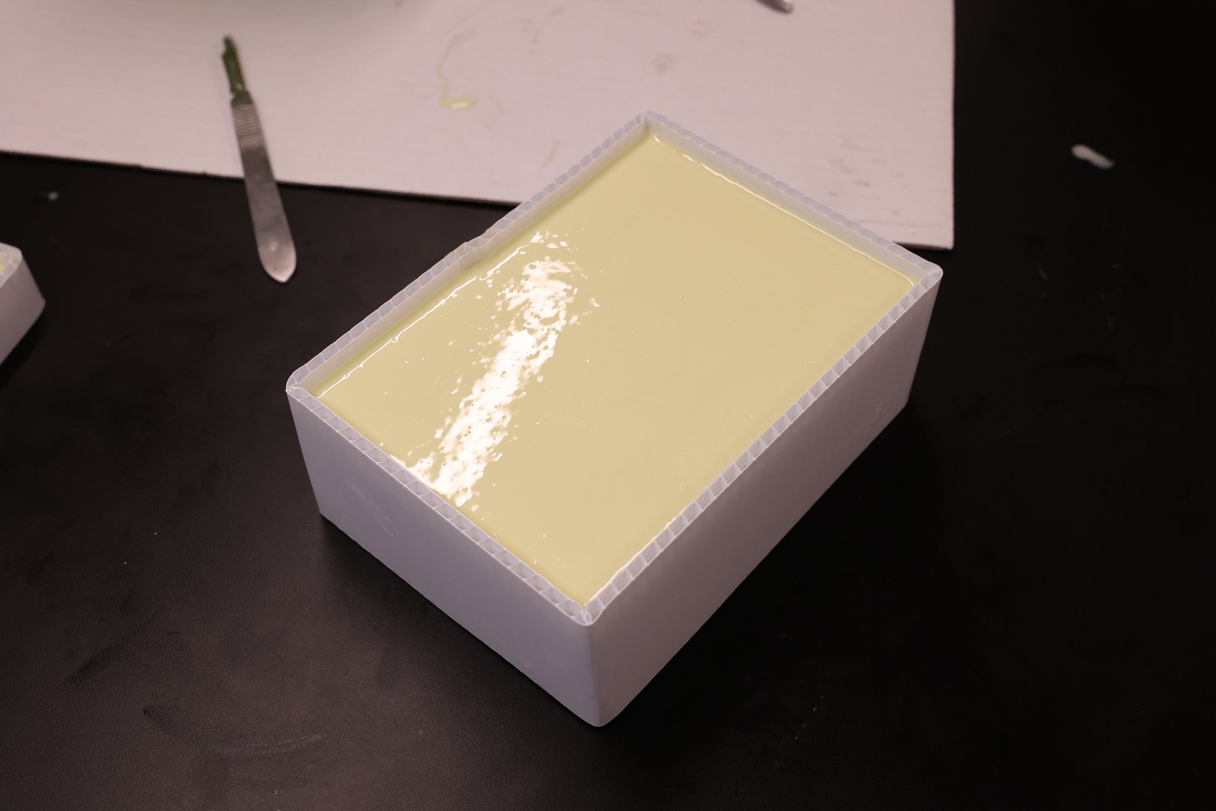
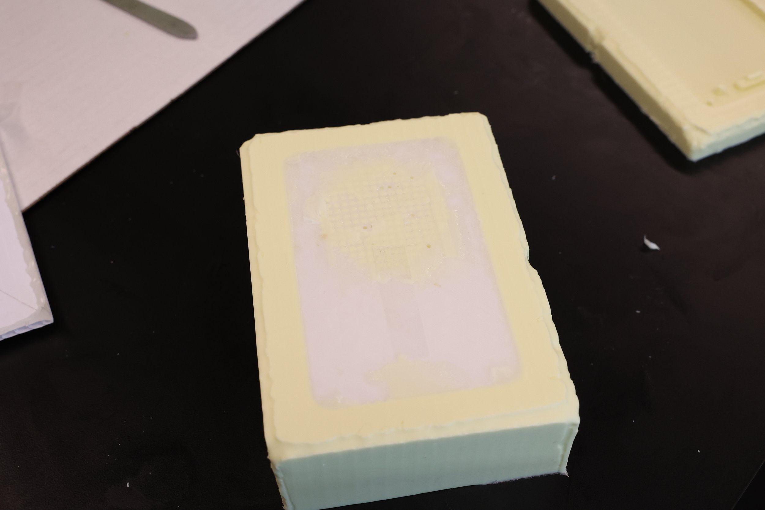
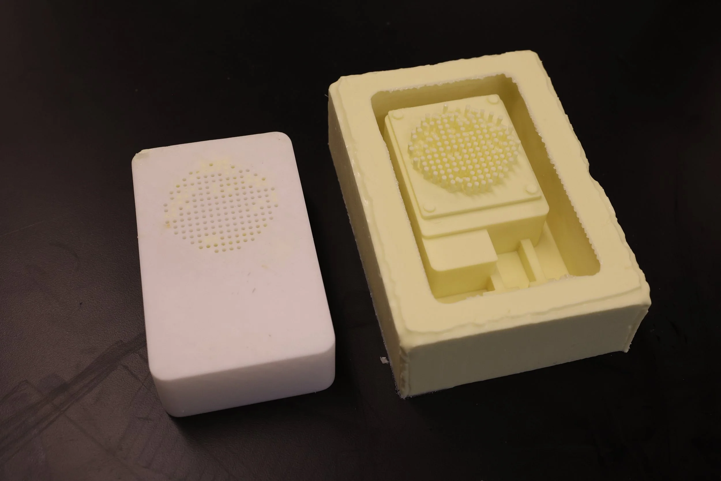
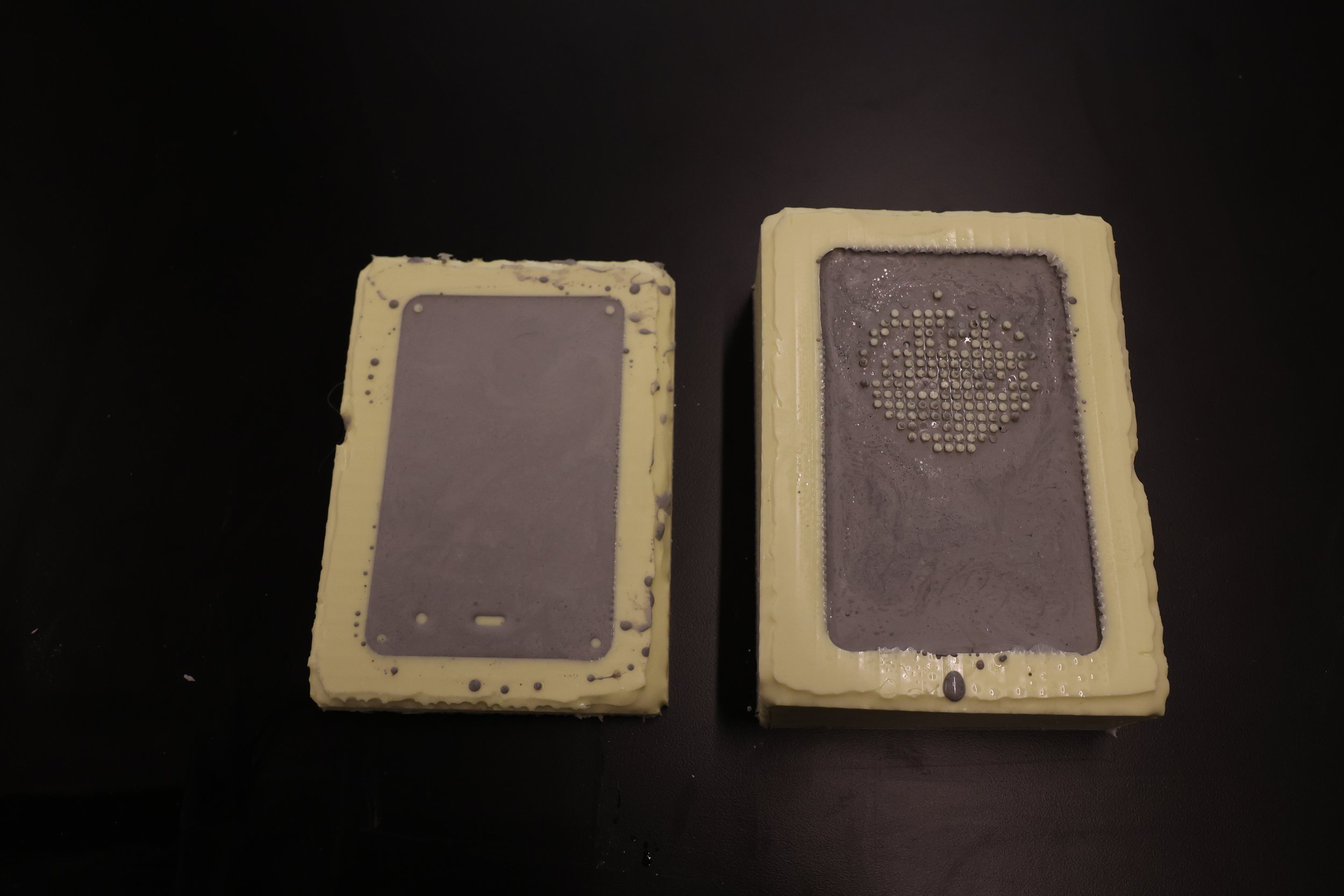
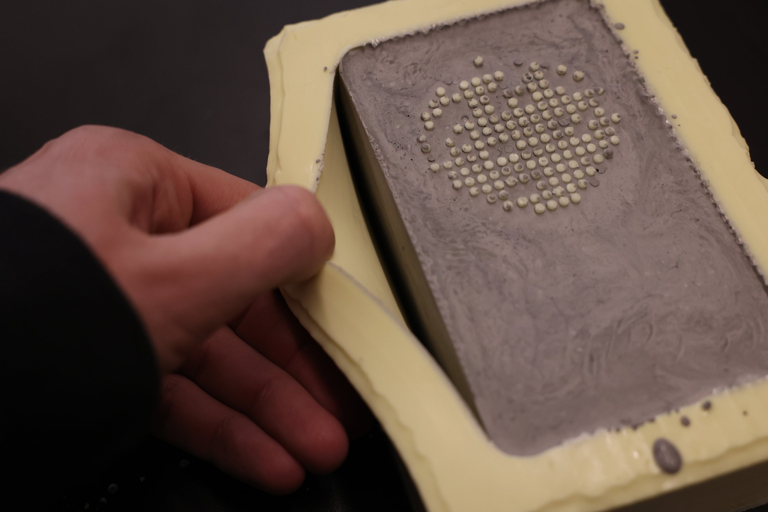
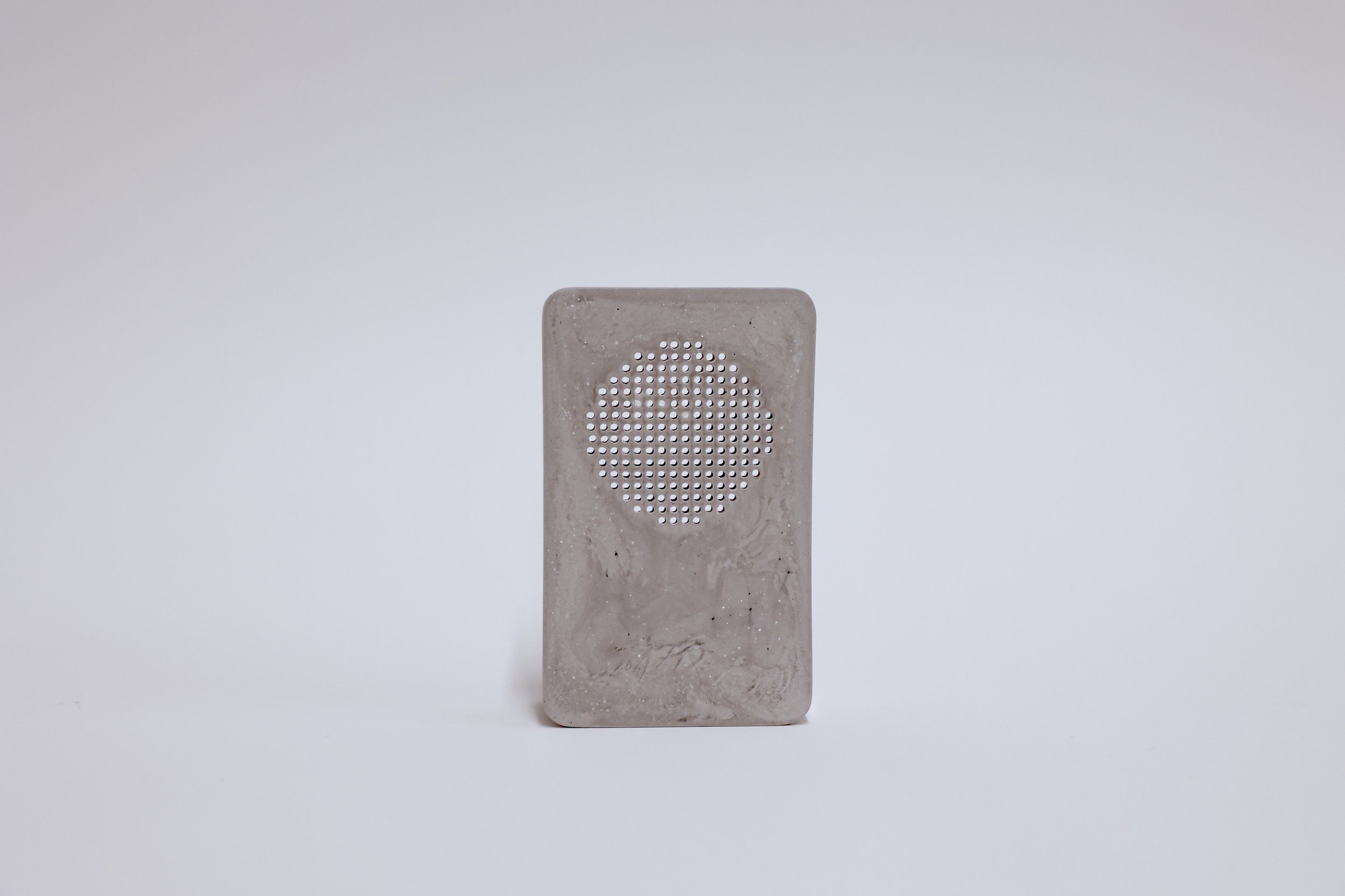
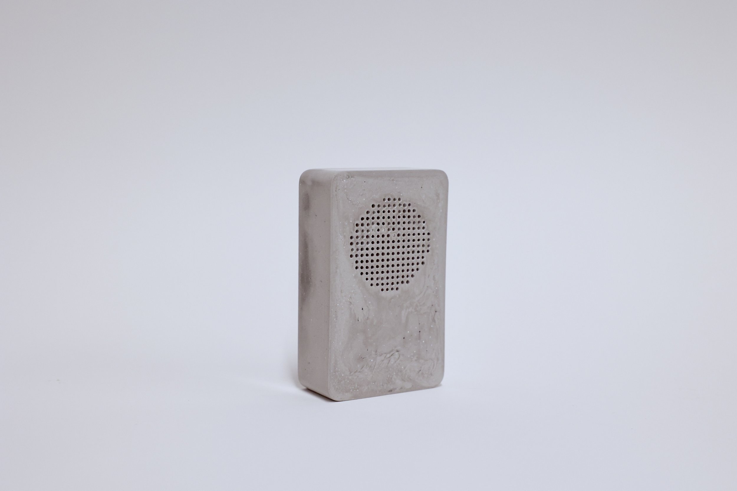
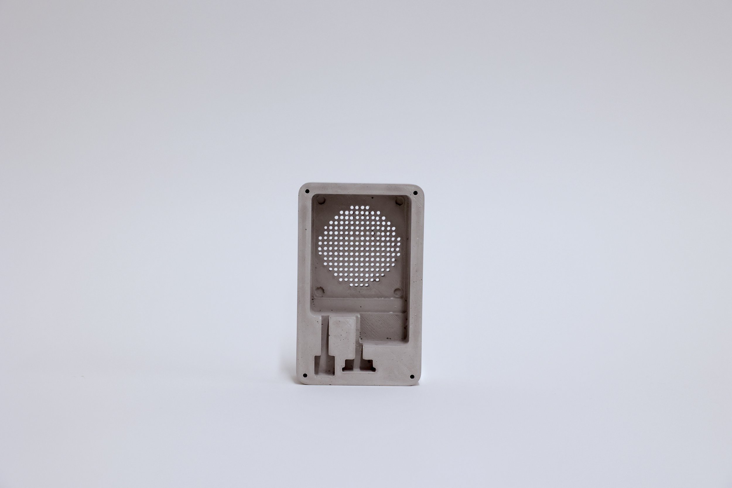
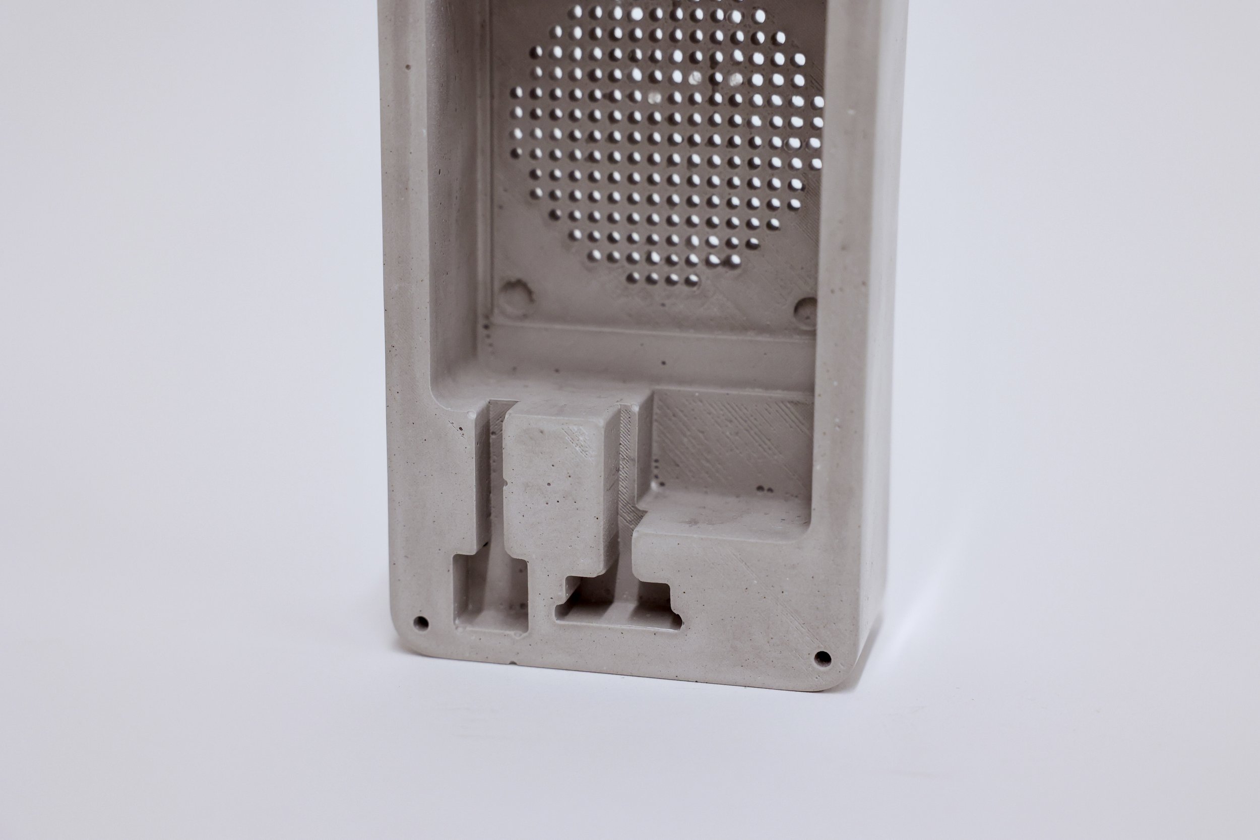
Iterations of Form
Final Components
Finished Algorithm
Reconsidering how the pacing of Memory Tracer could express time, motivated our decision to make the number of days that a memory take to reveal, to be equal to the number of years in the past of that memory.
We also decided to not just reveal a single
moment, but instead
reveal the entire location day.
Then when interacting with the device, it would show
where we had been, at the current clock time.
For example: If we looked at Memory Tracer
at 7:05pm on June 21, 2022 it would show where we had been
at 7:05pm on June 21, 2015.

