
Nui
Final group project for Creative Computing Capstone at Virginia Tech.
I proposed the project idea and led the 3 person group.
“Nui = New UI through extreme simplication”
Overview
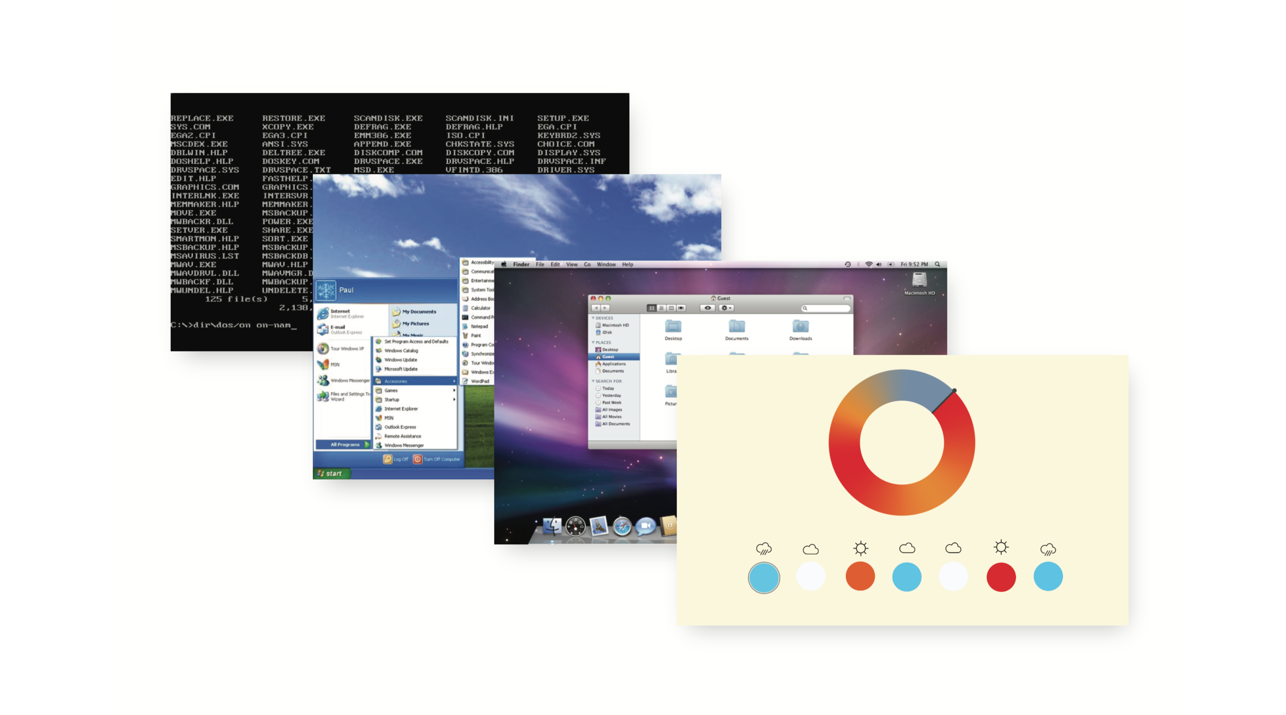
command line → GUI → NUI
Nui aims to create new user interfaces through extreme simplification. Since the first computer, developers and designers have been changing and optimizing user interfaces through the shift from purely text to the addition of colors, graphics, icons and transitions.
Our goal is to re-imagine the norm of user interfaces and push beyond the dominant use of text and icons. Nui explores a new future of UI through colors, shapes and transitions.
Initial Project Proposal

The idea for this project came from wanting to explore what might be next in UI design by creating a new user interface.
To help us push beyond the current norms, we gave ourselves the constraints of using no text or icons.
Ideation + Brainstorming
The team started by brainstorming ideas separately.
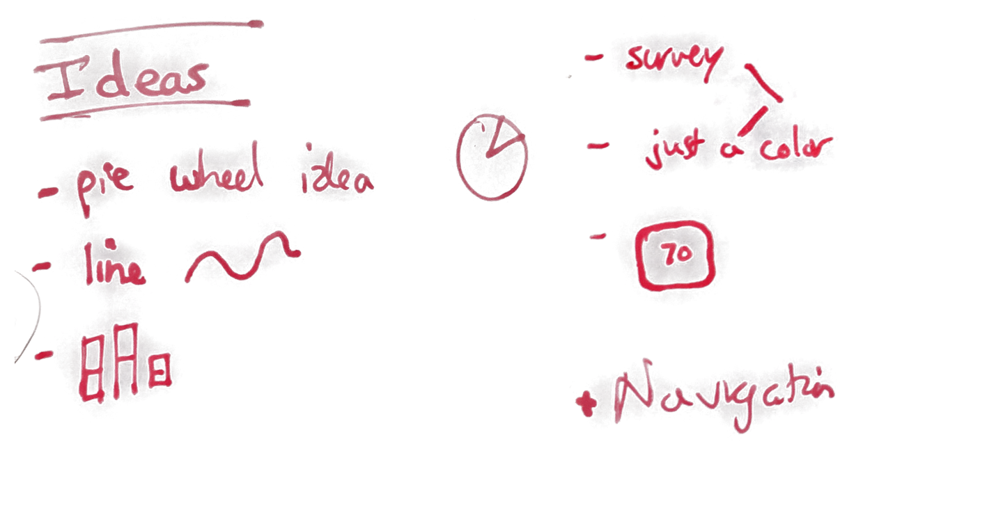
During brainstorming, I thought a lot about how people could potentially interact with phones in a new way. Initially I was thinking of Nui, more in terms of creating different user interface elements, rather than creating a specific application. I pulled some ideas from nature, and wrote down a lot of questions. Below are sketches and thoughts from brainstorming.

What if, instead of a slider, you just move your finger around on the screen, creating turbulence?

Thinking about curves and textures

Why do colors have the meaning they have?

more ideas and random thoughts
Decisions + PrototypinG
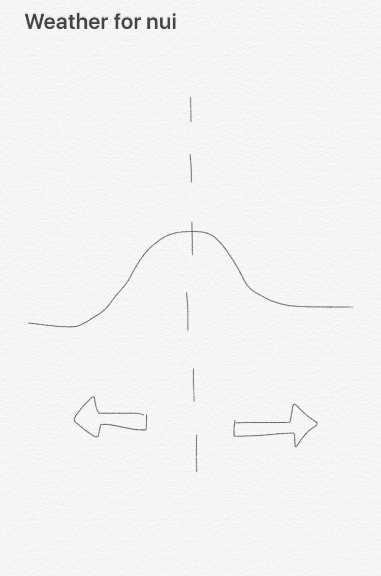
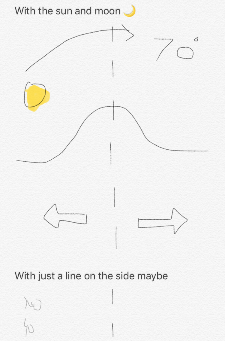
Next our team met to discuss ideas and set a game plan for the project. We decided to design for phones, and focus on specific applications instead of a random collection of UI elements. We started with weather, and began ideating around the singular task of displaying the forecast. Due to our constraint of “no text, no icons” weather was a particularly good place to start as apposed to something like an email client.
Creation
We moved forward with two weather ideas and one navigation idea, and began creating full mocks and interactive prototypes.


Iterations


Final Designs

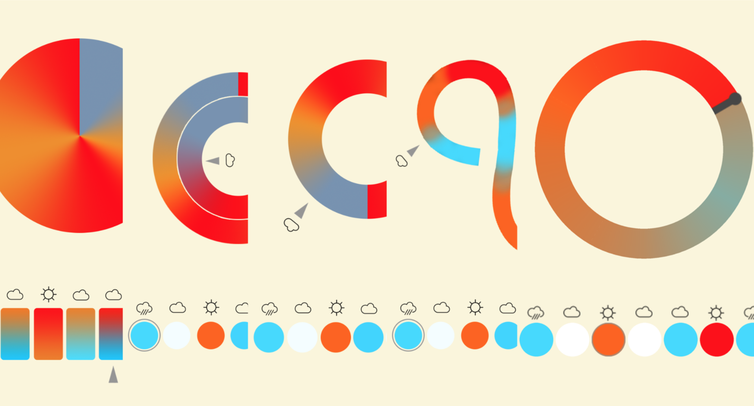
The main focus of this interface is the disk showcasing the weather in the middle of the screen. As the user rotates the cursor, it reveals the future weather. The 7-day calendar shows the average weather for the different days, and when tapped, shows different wheels for the different days.

The day’s temperature and precipitation at a glance. The line graph shows the temperature increase and decrease. The blue below the graph shows the change of rain. The darker the blue, the higher the chance.

The goal is to force the user to pay at- tention to roads and street signs around them instead of blindly follow the GPS, by removing information. This app does break our own “rule” of no text, but is extremely simple.
Logo for project
Because any good project needs a logo, I designed one.

Demo
The goal with this specific implementation is that with one glance you can understand the entire forecast for the day (rise and fall of temperature and when there will be precipitation). Simply swipe to see the forecast for the rest of the week.

digital sundial
Heart and Meaning behind nui
The following is an excerpt from my final essay on the project.

Night Shift
There was another idea which my team thought about during the semester. A digital sun dial. My practical, design focused mind cringes a little bit while thinking about this idea. Let’s be real, this idea is a bit absurd and not very practical. But it is important to allow your mind to go there and explore such ideas. While writing this essay, I thought about an iPhone automatically turning on Night Shift at 11:00pm. Night Shift is similar to Flux on a computer; it changes the screen’s contrast to appear more orange and thus make it easier on the human eye. If someone is using the phone at the moment between 10:59:59pm and 11:00:00pm, they instantly know that it is now eleven o’clock at night. They know the time purely from a slight change in contrast and color on the screen.
Honestly, this is the heart of what Nui was exploring. Sure, it was exploring a new future of user interfaces, but it was really exploring if there are better ways to represent information. Are numbers, text, and icons the best ways to represent weather? The final project argues, “not always.” Is a map the best way to learn how to navigate to a location? The final project argues, “not necessarily.”
The questions our team asked are what I am most proud of this semester. We asked questions in which there are no right answers. We had the potential to fail. We took freaking risks. Our project was creative because of the chance for it to fail. We pushed the status quo on what is expected and what is possible.
Below you can read my final essay about the project.