Personality Compatibility App
In undergrad, I discovered how fun it is to compare your personality with friends and people you meet. However, there wasn’t an app or website that made comparing easy to do.
The app is unbuilt, but it would be a fun project to eventually tackle. Especially since there are some interactions and animations I want to learn how to build.


Brainstorming
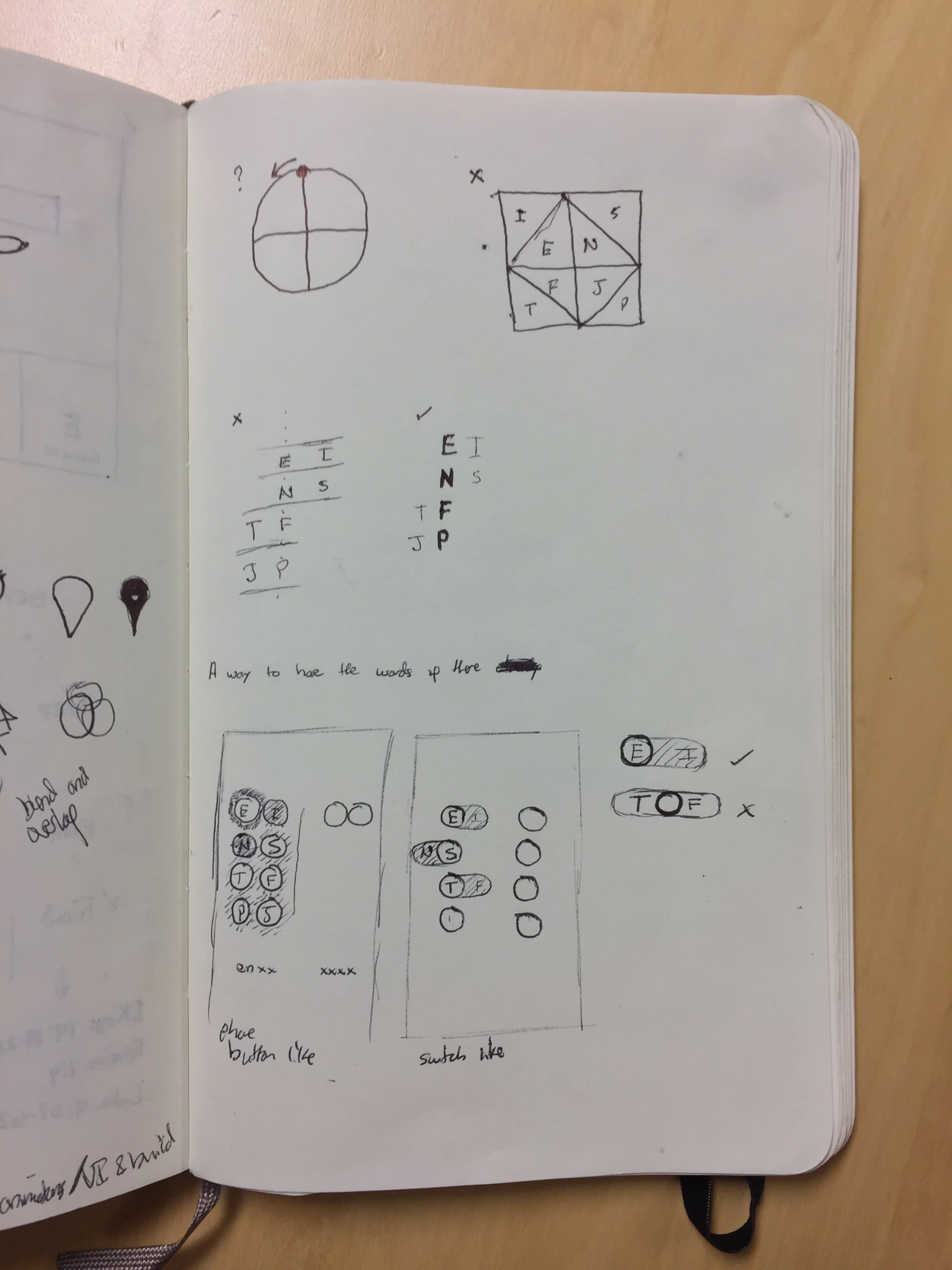
I began the design process by spending a lot of time thinking about how to enter 8 bits of information (4 traits per person). I wanted entering the data to be easy, fun, and look beautiful.

Brainstorming
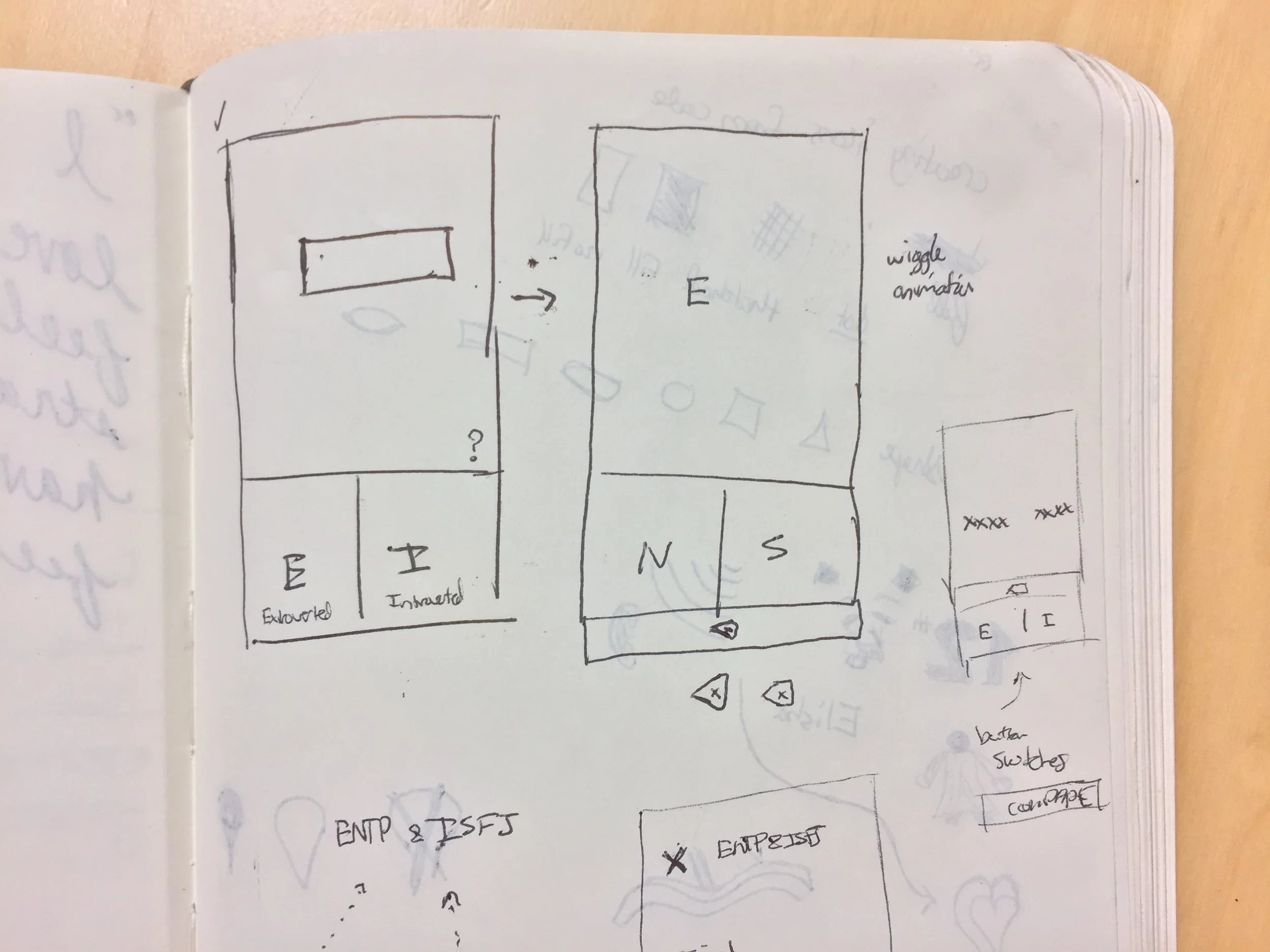
This wireframe had the most influence on the final functionality. The options on screen are only what the user is currently choosing. After the user makes a selection, the buttons change.

Initial UI in Sketch

UI Continuing to Develop
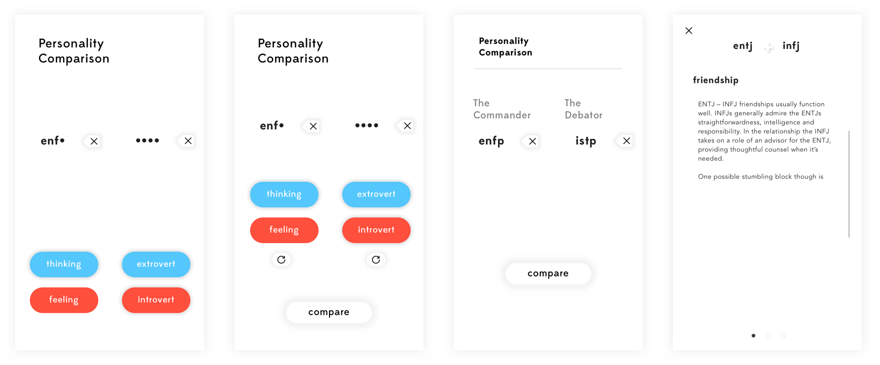
These mocks are where you can see the UI really start to come together.

Style
I pulled some from the style of Apple Music released in iOS 10.

Animations
As the user adds personality traits, the gray bar slides across to indicate which trait needs to be entered next.

Comparing
Once all personality traits have been entered, the gray bar moves to the bottom of the subview to form a down arrow.
To view the comparison, the user can either drag down or tap 'compare.'

The Comparison
The comparison shows the compatibility in friendship, work, and romantic relationships.